

Apple Watch · watchOS

Custom Apple Watch app icon design.

On Apple Watch your icon is a small circle on a dark screen. Details that look fine on iPhone disappear there, so the design has to work inside that circle.

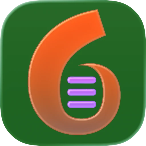
  • App icon of an orange number six with three lines on dark green
  • App icon of an orange figure walking out of a dark doorway on pale blue
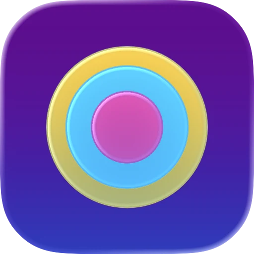
  • App icon of yellow, blue and pink rings on purple
  • App icon of a gold teapot on a deep navy background
On the wrist

Round, not rounded.

watchOS masks app icons into a circle. You still hand it square layers, and the system cuts the circle. Anything near the corners is gone, so the main shape has to sit in the middle.

The examples above are shown as rounded squares, the way they look on iPhone and Mac. On Apple Watch the same kind of layered design is cut into a circle and shown much smaller, so bold, simple shapes matter even more.

watchOS details

What's different on Apple Watch.

  • A bigger canvas

    Apple Watch icons use a 1088 × 1088 pixel canvas, a little bigger than the 1024 one for iPhone, iPad and Mac.

  • No black background

    Apple asks you to lighten a black background on watchOS, so the icon doesn't blend into the dark display around it.

  • One look only

    Unlike iPhone and Mac, watch icons have no dark, clear or tinted versions. Icon Composer shows no looks to preview for watchOS.

Next to your iPhone app

One design, two shapes.

If your Watch app comes with an iPhone app, Apple wants the two icons to look like the same app. One Icon Composer file holds the circular watchOS version next to the iPhone one, so the two are designed side by side.

See iPhone app icons for the iPhone side, or app icon sizes for every size Apple uses.

Pricing

Simple, fixed pricing.

Two packages — both fully booked right now. The waitlist gets first access.

Fully booked right now — capacity stays small so the 48-hour promise holds Join the waitlist
Fully booked

New Icon

From scratch

$199 one-time

You're starting from just an app idea or description.

  • Original design from just your brief
  • One round of revisions
  • 72-hour delivery after your brief
  • Xcode-ready icon package
  • SVG + PNG source files
  • 1024px marketing PNG
  • Light, dark, clear & tinted variants
  • Install notes + AI agent prompt
Join the waitlist
Fully booked

Every slot is taken right now.

Capacity stays deliberately small so the 48-hour promise holds. Leave your email and you'll get first access the moment a slot opens.

One email when a slot opens — nothing else.

Revision & refund — plain and simple

  • One design, one revision. You get one polished design and one round of changes — no endless back-and-forth.
  • A revision is a tweak, not a restart. Adjustments to the delivered design are included. A totally different concept or a changed brief is a new order.
  • Cancel before I start, full refund. Change your mind before production begins and you’re refunded in full, no questions.
  • After production starts. Once I begin, refunds aren’t normally offered — unless I don’t deliver what’s listed or clearly ignore your brief.
FAQ

Apple Watch icon questions.

Is an Apple Watch app icon round or square?

Round on the watch. You design square layers and watchOS cuts them into a circle, so the important part has to sit in the center.

What size is an Apple Watch app icon?

1088 × 1088 pixels, a little bigger than the 1024 × 1024 canvas for iPhone, iPad and Mac. The system makes the smaller sizes from it.

Can my watch icon match my iPhone icon?

It should. Apple asks for a consistent icon across platforms. One Icon Composer file can hold both the iPhone and the Apple Watch version, so they are designed side by side.

Does Apple Watch have dark or tinted icons?

No. watchOS has one look for app icons, so there's no dark, clear or tinted version to design. Avoid a black background, though: it blends into the watch screen.

More answers in the main FAQ.