Liquid Glass app icons, explained.
In 2025 Apple gave app icons a new look made of Liquid Glass, starting with iOS 26 and the other 26 releases. Here's what it is, what it means for the icon you have now, and how to get one that fits.
What Liquid Glass is
Liquid Glass is the material Apple introduced in June 2025 across iOS 26, iPadOS 26, macOS Tahoe 26, watchOS 26 and tvOS 26. It's translucent and behaves like real glass: it reflects and bends what's around it, and catches highlights as things move.
App icons on iPhone, iPad, Mac and Apple Watch are now built from it. Each icon is a background plus one or more foreground layers, and the system adds the glass effects on top: highlights, refraction and translucency. Those effects adapt to the icon's size and can look a little different from one system version to the next.
Default, dark, clear and tinted
On iPhone, iPad and Mac, people choose how their Home Screen icons look. Clear and tinted each come in a light and a dark version, so Apple counts six appearances in total. Apple Watch icons have just one look.



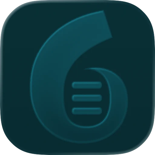



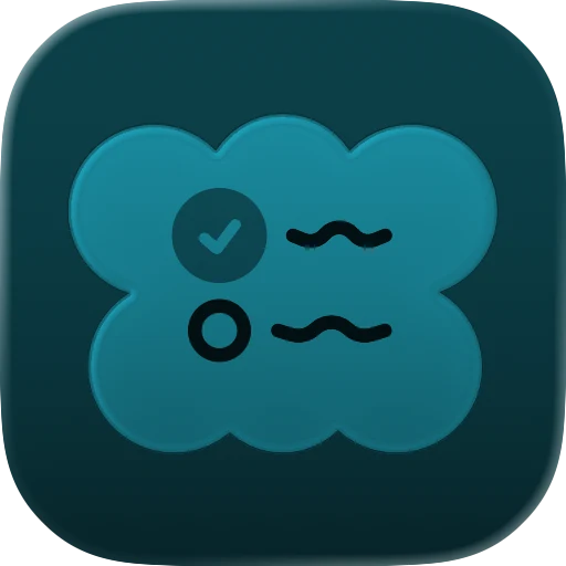
These are two icons I made, exported straight from Apple's Icon Composer in each look, not mockups.
- Default is your full-color icon.
- Dark is a calmer version for dark mode. Apple suggests building it from your default icon with matching, less bright colors.
- Clear turns the icon into mostly colorless glass, so it sits quietly on top of the wallpaper.
- Tinted recolors the icon in a single color the person picks.
Apple asks that the icon keeps the same core shapes in every look, so people can still find your app when they switch.
Icon Composer and layers
Liquid Glass icons are made in Icon Composer, Apple's free icon tool that comes with Xcode. The flow goes like this:
- Draw the foreground shapes in any design tool and export them as layers, SVG where you can.
- Bring them into Icon Composer and set the background as a solid color or gradient.
- Group the layers and tune the glass: highlights, shadows, translucency and more.
- Mark what changes for the default, dark and mono looks. Mono is what the clear and tinted looks are made from.
- Preview it on iPhone, iPad, Mac and Apple Watch, then save one .icon file for Xcode.
Apple keeps refining the glass. Some settings, like refraction, only show up on the 27 releases.
What changes for an existing icon
If you never touch your icon, the system makes the dark, clear and tinted versions for you. Apple notes that dark icons are more subdued, and clear and tinted ones even more so. An icon that relies on color, fine detail or a baked-in shine can get hard to recognize in those looks.
To make an older icon feel at home, it usually needs:
- Splitting into a background and a few clear foreground shapes.
- Removing drop shadows, bevels, glows and gloss. The system adds its own, and baked-in ones fight with them.
- Square, unrounded art. The system adds the rounded corners, or the circle on Apple Watch.
- Fewer thin lines and no small text, so it still reads in every look and at every size.
- A check of each appearance, with dark and mono tweaks where needed.
Once you add an Icon Composer file to your Xcode project, it replaces your old AppIcon asset catalog. If your app still supports older system versions, Xcode builds matching images for them from the same file. Canvas sizes and the other rules are on the app icon sizes page.
How 48h Icons delivers them
Every icon I make is built in Icon Composer as a layered Liquid Glass icon and checked in each look. You get the .icon file ready for Xcode, previews of the light, dark, clear and tinted looks like the ones above, a 1024px PNG, SVG and PNG source files, install notes and a prompt your AI coding agent can use to install it.
Already have an icon that looks flat or dated next to the new ones? That's the Icon Refresh. If you built your app with an AI tool and have no icon yet, see icons for AI-built apps. Platform details: iPhone, iPad, Mac and Apple Watch.